ICONOGRAPHY AND DIGITAL NAVIGATION
Journal / Our Work, Strategic Insights / 29.08.13
The Digital use of Semiotics in information architecture and navigation systems
Semiotics refers to the study of signs or in the case of the web, to the study of icons. Icons are a simple visual language suggesting actions and communicating information.Systematically in our everyday life, we visually scan and identify icons subconsciously, from road signs to web interaction, as we permanently need to be oriented in our circulation or navigation.
Icons in web design play a major role in the website’s usability enhancing considerably the user-experience.
Because reading icons is fast, intuitive and familiar, iconography can effectively boost the UX and navigation challenges. It offers an easiest way for the end-user to find the information he seeks only through visual aids.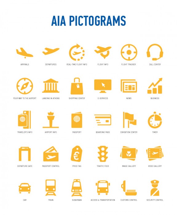
Why icons
The use of icons can sustain immediate visual identification. Adding icons to your website can not only increase its aesthetic appeal but also speed up the process for visual lecture. Well-designed icons are those that suggest the action or function, those that highlight the topic to which they refer, and communicate a clear message with or without caption. This visual language enables users to easily navigate throughout the site while simultaneously understanding the message and identifying the brand.
The use of icons in web design is a grown trend arising around menus. Icons can be used instead of the text or as a supportive visual language in their navigational scheme.

Best Practices/Tips
Here are some tips for creating good web iconography.
- Add branding to personalize icon. Brand identification is essential.
- Customize your icons according to clients’ needs.
- Place them in the right position with the right context. Information Architecture is crucial.
- Design icons should be universally recognizable.
- Use clean and intuitive icons to enhance the user experience.
- Use your icons as webfont. It allows full scalability as well as the total integration of the menu in a responsive site.
- Less is more. Complicated icons or extensive use can lead to negative results.(complexity of lecture, loading)
- Test your design. Icons don’t serve their purpose if they don’t convey what they stand for instantaneously.
AIA iconography
Exclusively for the Athens International Airport Website, Mozaik creative team and development staff created a set of 130 icons to support the site’s navigational scheme.
The scope was to create clean, seamless navigation, enhanced by straightforward and effective iconography. The icons are designed to apply in multiple applications and carry the AIA branding elements.
A set of fully customized flat icons with a 2px radius was designed and converted into a webfont to serve the menu’s responsive features.
This set of specific pictograms appears throughout the website as well as in the mobile app, info-points and interactive map, indicating the types of available action, function and information.
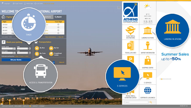
The new website’s navigation is particularly remarkable and distinctive.
The large icons, responsive as the menu itself, offer the user striking, immediate and straightforward information.
Mozaik transposed the visual relationship visitors can have with the airport’ s signage (on-site) into the online navigation system of the website. When they visit the website to acquire specific information, web-users relate unconsciously with the images and visual reference, they are already familiar with.
Because an icon worth a thousand word, Mozaik invites you to navigate through AIA new website.