MOZAIK CONCEIVES THE BRANDING OF CITYFAB
Journal / Our Work / 03.06.15
Inspired by Cityfab’s ground-breaking approach to connect high-end beauty professionals with customers so as to instantly bring beauty to their doorstep Mozaik envisions, undertakes and develops Cityfab’s branding including the conception of the company name, logo and corporate identity all reflecting its upscale status and field of expertise: beauty.
The name Cityfab derives from the words city and fabulous denoting the frenetic pace and glamour of city-life and how despite the tight schedules and multi-tasking nature of our world people now have the chance to instantly be treated by a Cityfab, get a Cityfab or be a Cityfab with a click of a button.

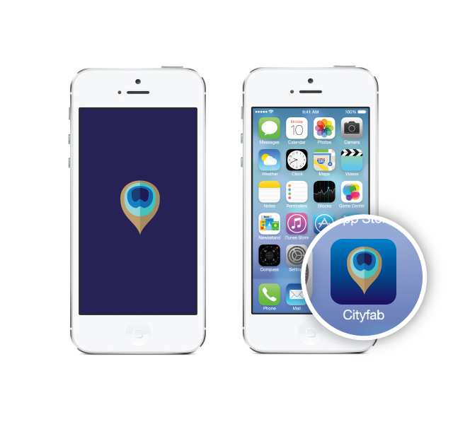
This innovative international beauty app offers all kinds of beauty services from hair styling to nail art, beauty treatments, soothing massages and personal training. All that a Cityfab could ever need, right here, right now!

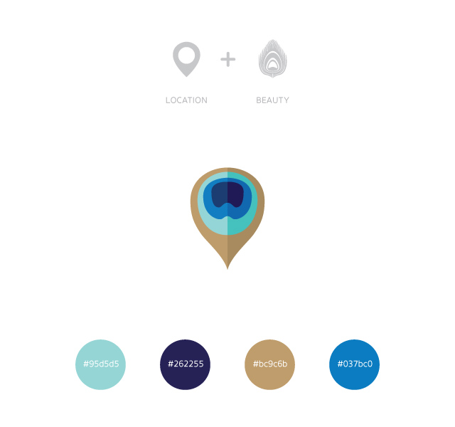
The company’s logo & corporate id combine the notions of immediacy and beauty with the pin denoting location and the feathery shape of a peacock denoting pride and prettiness. The shades of blue from the sea and sky stand for calmness, elegance, sophistication, professionalism, while the gold stands for prestige, luxury, charisma, success and abundance.

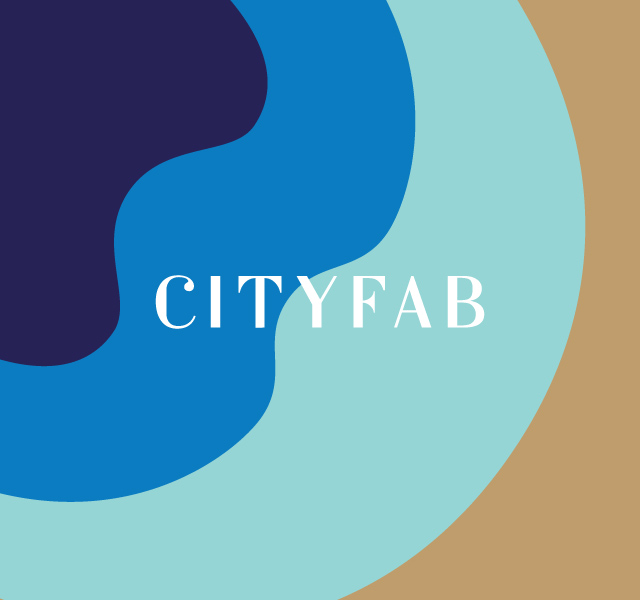
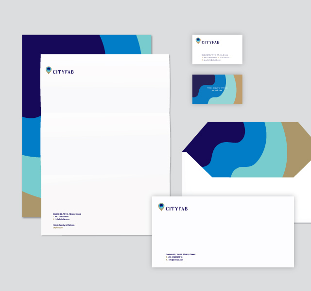
For the corporate identity an enlarged version of the logotype was selected as the main graphic element referring to the figure of the human body, the hair styles, the massage techniques, the nail lacquer, the beauty products and the soothing flow of lotions on the body…gradually reaching to the core of beauty.

