Piraeus Bank
Close to you, every step of the way, caring for your every need, before you even ask.
Piraeus Bank A.E. is a leading bank in Greece as well as a multinational financial services company headquartered in Athens with an international presence in Bulgaria, Albania, Ukraine, United Kingdom and Germany. It is an innovative institution well known for its forward-thinking mentality as well as its cultural and social engagement. Aiming to be the most trusted bank in Greece, creating value for its shareholders, clients and employees, Piraeus Bank concentrates on four key strategic principles, customer focus, management accountability, performance-driven culture, and sustainability of its business model.
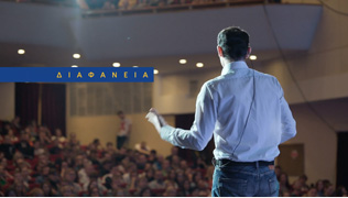
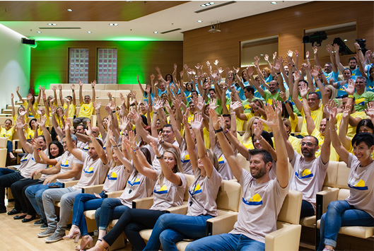
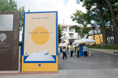
Piraeus Bank was in search of a creative and innovative way to communicate the Bank’s new corporate culture along with its 4 new corporate values among its employees. The Bank assigned Mozaik to communicate the bank’s new culture in a very professional and inspired way and introduce the 4 New Corporate Values without being exhaustive or dull to all employees attending the Piraeus Bank’s Values Festival.
After studying closely, the axle of the Bank’s newly introduced corporate culture, along with its values, mission and purpose, Mozaik first visualized the four values and set the visual communication tone of the cultural transformation key-messages and the event branding. Then, Mozaik conceptualized the brand identity of the values festival, designed all branding elements, offered consultation on scenography and produced the event tagline along with a signature video aiming to convey the value-DNA of Piraeus Bank.
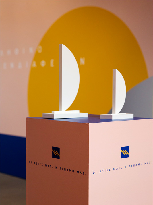
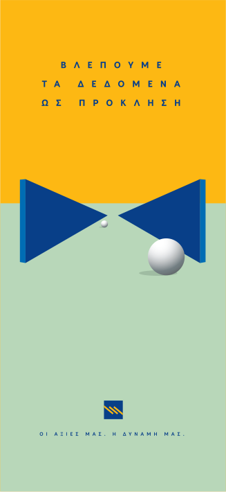
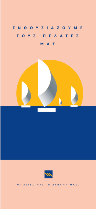
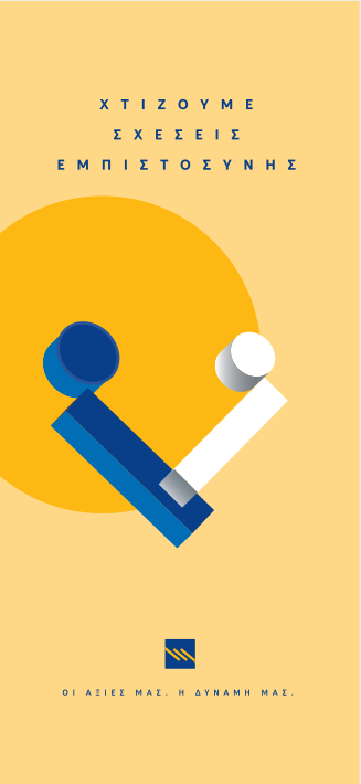
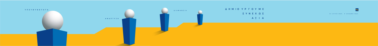
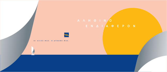
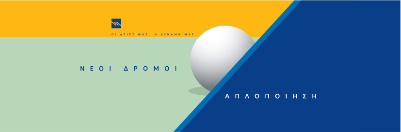
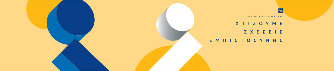
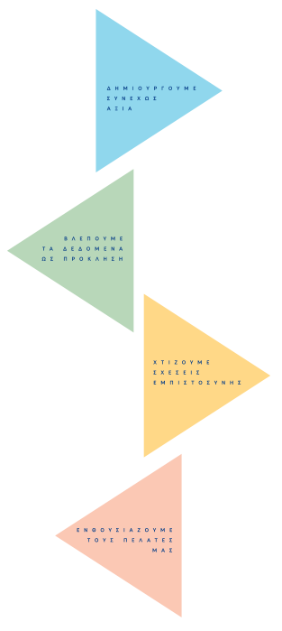
Each value had to be depicted in a different way, still belonging to a group of representations. We wanted the concept to be contemporary, strong and supportive to the main message “Our Values. Our Power”. Each value, abstractedly shows what it verbally describes but not on the first level of interpretation. The aim was for the people of the bank to be allowed to give their own personal interpretation and at the same time develop in their imagination a complete image of what this value represents for them. Values may be a fact but each person offers its own input when applying and adopting them.
The world of Art helped us give life to our concept. Inspired by the geometrical abstraction of the Suprematist art movement, the intense horizon and heavy shadows of the Surrealism and the modernity of today’s pale colours used in design, we created a universe of symbols expressing the Bank’s values.
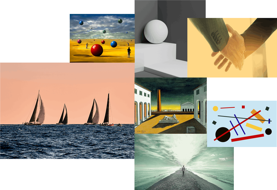
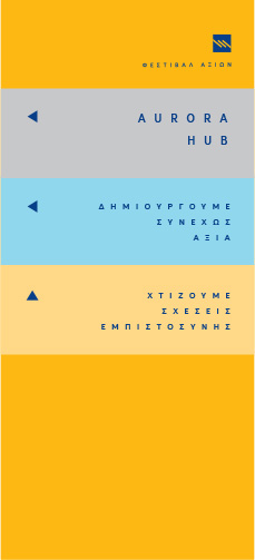
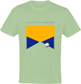
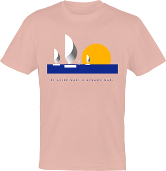
Each value had to have its own symbol, a unique representation that stands out. Bold shapes, white and statuesque, dramatic perspectives and the antithesis between the Bank’s basic colours (blue and yellow) as well as the additional 4 complementary ones: baby blue, soft green, powder pink and light, warm yellow. Each visual is a geometrical, minimal, symbolic expression of each one of the Bank’s values with a strong, individual colour identity.
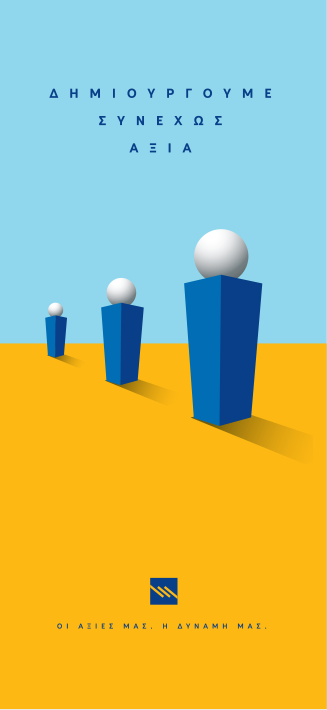
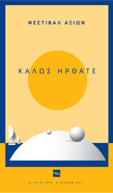
The hero visuals for the 4 values had to be incorporated into the building’s various spaces so as to create distinctive areas, each one with its own colour code and atmosphere. The rooms and the hallways, the stairs and the walls were covered with vast and bold illustrations based on the main symbols. Additional values on the surfaces intensified each area’s identity. 3D constructions such as spheres and boats, brought the 2D graphics to life, making them a vital part of the space.
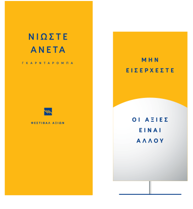
Various signs were designed so as to ensure the guests’ smooth and enjoyable journey throughout the festival spots. A huge “Welcome” sign at the entrance, billboards to guide the crowd to the right colour coded area, “No Entrance” signs for the areas that hadn’t been used for the festival, signs for the cloakroom and the refreshment spots, always using a non-formal, friendly language.

Each one of the bank’s 4 values had a t-shirt designed for it, based on the 4 hero visuals. The colorful t-shirts united the crowd under the same roof, creating a uniformity that was visually fun and intriguing. The t-shirts gave everyone a feeling of belonging, adding to the effortless team spirit.


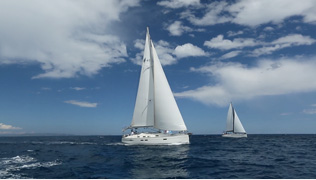
Blue and Yellow are the two basic colours of the Piraeus Bank branding. They are also the prevailing colours that one may come across while in Greece. The first part of the video is a collection of impressive Greek locations, focusing on blue skies and sea, sunny everyday moments and the optimism the beauty of Greece allows for. The second part focuses on the bank itself, its values and inspiration, springing from values Greece has instituted in each and every one of us, living here. Blue and yellow stand out. In all their shades and so does the power of light and optimism. The beauty of vision and creation.